How to Draw Lines on Think or Swim
Setting Up Your ThinkorSwim Charts for Beginners
A beginner's guide to creating studies, chart settings, adding support/resistance levels and saving your workspace.
When you open ThinkorSwim (TOS) to a chart for the first time it will look like this. This is the SPY's intraday chart.
This is a customized intraday chart suited for my needs. I will walk you through how to personalize the most commonly used features of the TOS chart. 
We will cover the beaker and the gear icon (both are circled below in orange, read left to right) and how to draw levels of support and resistance.

Adding Studies
The beaker icon is first and is called the "Edit Studies and Strategies Window". This is where you add your "Studies" (technical indicators), "Strategies" (already programmed strategies TOS provides) and "Sets" (your saved "Studies").  The most commonly used technical indicators are the Previous Close (or r/g line - the line that indicates at what price the stock closed on the previous day closed), VWAP (volume weighted average price), EMA (exponential moving average), and SMA (simple moving average).
Refer to the below screenshot for order of reference.
First (1st), we type in the name of the strategies we want to add. When the one you want appears, double-click to add the study. Note: notice how the exponential moving averages (MovAvgExponential) are listed differently than the simple moving averages (SimpleMovingAvg).
Note: the Previous Close or "r/g" line in TOS is not automatically included, you have to add it the code. We will review this in a bit.
Second (2nd), we'll click the gear icon located to the right of the study (labeled 2nd) to customize the way it looks and the specifics of the duration.
Third (3rd), you can either double-click and type in the duration/number of your average or you can use the "+/-" to get the desired duration of the technical indicator.
Fourth (4th), here you can change the "Style" of the line that appears to dashed or dotted. You can also change the width of the line by choosing your desired "Width". Finally, you can select "Color" to define the color you want your indicator to appear as.
Fourth (5th), you hit ok to save the indicator.
 All of the technical indicators differ in the ways that you can manipulate them and I'll review the VWAP (below) as it's one of the most commonly used technical indicators.
First (1st), double-click on the VWAP indicator. Second (2nd), you will select the "UpperBand" tab. Third (3rd), you will uncheck all of the options in the box if you do NOT want the VWAP Upper Deviation Band. If you do, you can modify it as you would the moving averages: the Style, Width, Color, etc. Fourth (4th), you will select the "LowerBand" tab and uncheck the same boxes as mentioned in step 3. 
Now let's talk about Previous Close or "r/g" line in TOS which, as stated earlier, is not already a technical indicator built into ThinkorSwim but one that we have to program in. First (1st), we should still be inside the studies window labeled, "Edit Studies and Strategies." Second (2nd), we will select "New…" in the lower right-hand corner of the Studies window which will launch the "New script: NewStudy0" window. Third (3rd), we will copy and paste the code (below in italicized font) provided into the "thinkScript Editor" box. Fourth (4th), you will rename your study, I have called mine "PrevClose". Fourth (5th), select "Ok" and you have added your study.
plot Data = close;input aggregationPeriod = AggregationPeriod.DAY; input length = 1; input displace = -1; input showOnlyLastPeriod = no; plot PrevDayClose; if showOnlyLastPeriod and !IsNaN(close(period = aggregationPeriod)[-1]) { PrevDayClose = Double.NaN; } else { PrevDayClose = Highest(close(period = aggregationPeriod)[-displace], length); } PrevDayClose.SetDefaultColor(GetColor(9)); PrevDayClose.SetPaintingStrategy(PaintingStrategy.HORIZONTAL);
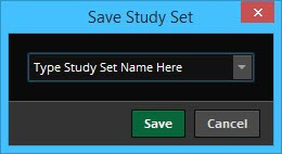
 Once we have finished adding all of our studies we have to save our study set or we'll have to constantly re-add and customize the studies. We do this by right-clicking on the chart, then "Studies", then "Save study set…".

This window (below) will be prompted, this is where you will name and "Save" your study set.

Simple vs Exponential Moving Average
The difference between a simple and an exponential moving average is that the simple moving average will take the duration of the range and average out each data point and weigh them evenly. Let us use the daily 9ema vs the 9sma. The 9 sma would simply add each day and divide by 9 whereas the 9ema will apply more weight to the most recent days. You can find a more in depth discussion between the differences by visiting http://www.investopedia.com.
Below is an example of the difference between the 9ema (yellow line) and the 9sma (red line).
 Customizing Chart Settings: The Gear Icon
Now we're customizing the chart setting by clicking the Gear Icon. I will walk you through the most popular options.
We'll begin with the "Content" section under the"General" tab (the defaulted page you will prompt after selecting the Gear Icon).
We'll begin with 4th in the screenshot below, "Studies: Show studies". Ensure the "Show studies" box is checked so that your studies appear on the chart.
Fifth (5th), "Display: Show Trades". If you are using TOS as your broker and would like your trades to appear when you execute an order, you will need to check the box labeled, "Show trades."
Now let us move to the "Settings" section.
Sixth (6th), "Snap drawings to: OHLC". Select "OHLC" in the drop down menu under "Snap drawings to", the default is "(none)". Choosing this option ensures that your drawings snap to either the Open/High/Low/Close of the candle. This makes drawing levels of support, resistance and trendlines much easier.
Seventh (7th), "Synchronize: Drawings and Crosshairs position". Checking the "Drawings" box ensures that if you have multiple charts of the same symbol open, let's say for multiple timeframes, that the drawings will sync to each window. It will sync with every new chart of that symbol that you open. The "Crosshairs position" causes the cursor to appear in the same place on every chart, making analysis easier.
Eighth (8th), "Time Zone". This is where you select which timezone you want the chart to be in. If you select eastern time, as I have below, then your charts will display the open at "9:30am," as it does on the east coast.
Ninth (9th), "Layout: Overlap volume". I always uncheck the defaulted "Overlap volume" box because I do not like the volume in the same window as my candlesticks, I like them below.
Tenth (10th), "My Tools: On each chart". I select this option to display my most frequently used tools to float above my chart for easy access.
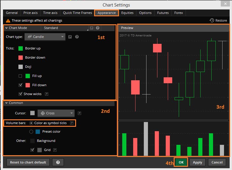
Now we'll move onto the 11th step in the screenshot below by selecting the "Appearance" tab.
 The Appearance Tab
This is where we customize the way the chart looks visually, i.e., the candles and the volume bars.
First (1st), "Chart Mode". This is where you select the Chart type, the colors of the candles and whether you want them to be hollow or filled in.
Second (2nd), "Common." This is where you select the option for "Volume bars: Color as symbol ticks." I like to have the volume bars appear the same colors as the color of the candles. If you do not select this option or care you can leave this to the defaulted blue color.
Now select "OK" to save all of our changes.
 Adding Levels of Support and Resistance
You can add levels of support and resistance through two ways.
You can right-click on the chart, "Add a drawing," then select "Price Level".

Or you can select on the "Drawings" in the toolbar located above your chart and then select "Price Level."

This will activate the drawing tool. Simply double click anywhere on the chart to draw a level.
Note: to draw a trendline, just select "Trendline" which is listed above"Price Level".
If you want to personalize the level of support/resistance you have just drawn, right-click on the level and select "Edit Properties".

You will have prompted the "Properties" box which allows us to personalize the way the levels display. In the first section (labeled 1st in the screenshot below), you can "Name" the price level and select "Show name:" in order to have the designated name appear on the level. Select "Show price:" to designate whether you want the price of the level to appear on the level and whether you want it to display on the left or right.
In the second section, here we can key in the exact value of the price level in case we were a little off when drawing it under "Value:".
In the third section, we can change the "Color", "Style," and "Width."
To make this customization the default of all of our support/resistance levels we select "Save as default" (4th in the screenshot below), then "OK".

Saving Our Workspace
Lastly, we want to save the modifications we've made to the chart, similar to how we had to save our studies. We'll do this by saving our workspace. First, click the gear icon next to the x button at the top of the ThinkorSwim window. Second, we'll select "Save Workspace as…", and now we'll name and save our workspace.
Your "workspace" encompasses the entire ThinkorSwim layout. I typically have charts open on 3 monitors and I'll save the workspace layout to ensure that when I start up my workstation I can open ThinkorSwim and the layout I have prepared for all 3 monitors is prepared and ready to go.

There are more advanced studies, saving techniques and tools you can utilize in ThinkorSwim. For more information, you can always check out ThinkorSwim's Leaning Center at http://tlc.thinkorswim.com/center.html.
@azintothewoods
Feb 10, 2017
How to Draw Lines on Think or Swim
Source: http://azintothewoods-tricksofthetrade.blogspot.com/2017/04/setting-up-your-thinkorswim-charts-for.html
0 Response to "How to Draw Lines on Think or Swim"
Post a Comment